Case Study House Program: References

List of books:

  • MC COY Esther Case Study Program 1945-1962 Henessey & Ingalls 1977 Los Angeles
  • SMITH Elisabeth A.T. Blueprints for Modern Living: History and Legacy of the Case Study Houses MIT Press 1998
  • STEELE James, JENKINS David, KOENIG Pierre Pierre Koenig Phaidon Press 1998
  • MC COY Esther, BLAKE Peter Craig Ellwood Architecture Hennessey & Ingalls 1997
  • ALBRECHT D. The Work of Charles & Ray Eames
  • COLOMINA Béatrice The Work of Charles and Ray Eames, A Legacy of invention 1997
  • STEELE James Eames House, Charles and Ray Eames Architecture in Detail Phaidon 1995
  • HINES Thomas S. Richard Neutra and Search for Modern Architecture University California Press 1994
  • MC LAMPRECHT Barbara Richard Neutra Complete Works Taashen 2000
  • SACK M. Richard Neutra Gustavo Gili 1994 Barcelone

List of articles:

  • Baboulet, Luc; « Le Case Study Program et la tradition américaine »; AMC (France); n°98; 05/1999;
  • ; « On the Mies Edge »; Domus (); n°614; 02/1986;
  • Goldstein B.; « The Entenza Years »; Art and Architecture (Etats-Unis); n°; 1990;
  • ; «  »; Architecture d’Aujourd’hui (France); n°; 02-03/1966;

<Previous pageBack to the first page >

Case Study House Program, Problems and Solutions – Relation with the site

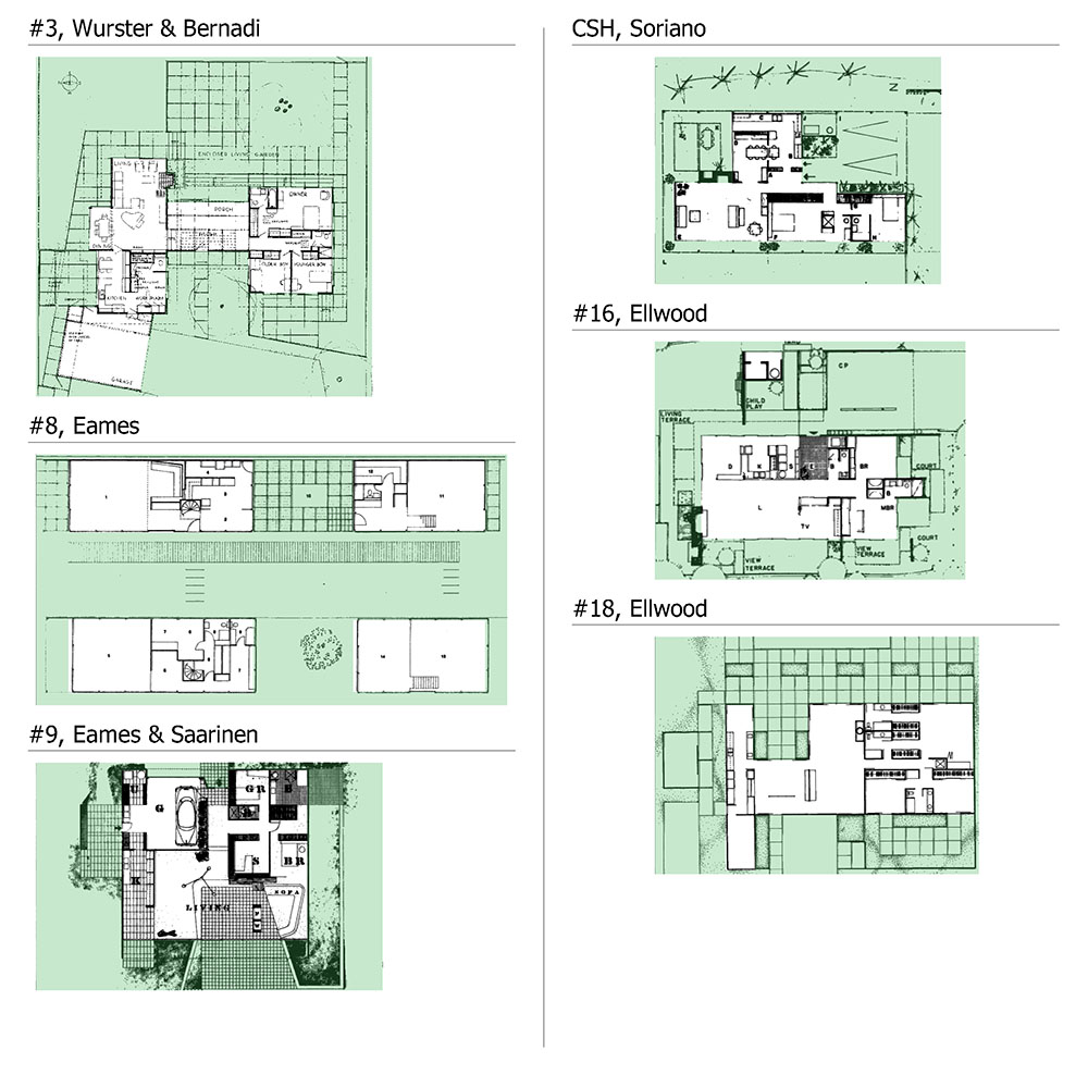
There are three types of reports to the site and the environment developed in the Case Study Houses. These three types of reports are usually completely dissociated. Each report is a ladder to a particular set distance between the site and the villa. They are: environmental entering the house, in direct and internal relationship with the house the immediate environment and in direct connection with the outer and Villa; Finally the distant environment, landscape. Ellwood perfectly illustrates these three types of relationship to the environment in terms of its Case Study House # 16, where it designates and distinguished: the « child short, » the « living terrace » and « view terrace ».

The « inside » environment the current and patio

The Case Study Houses are systematically locate lightweight way to the site. Always posed, suspend in or slightly above the ground, their locations never require heavy excavation. This type of implantation induces a minimal impact on the ground. This is perfectly illustrated by Case Study House # 21 of Koenig, of which we see the attached structure.
This method of implantation naturally allows a multitude of games with the site. Spontaneously may emerge in the house remained untouched natural soil and rub nature in the heart of the house. It is thus are widely used in the Case Study Houses patios and outdoor-indoor spaces. The villas of the Case Study House are placed in the site but unlike the Villa of the Modern Movement is to melt it.

The close environment: the importance of the garden

The villas of the Case Study Program are implanted mostly in residential suburban neighborhoods. Therefore, they generally occupy a limited land that they can not yet handle limits. The work of the Case Study House program designers, therefore, is to limit and qualify this place generally undifferentiated and deformed that fits between the bounds and those of the house. The garden is treated either as a buffer zone from creating distance between the public space and of the house is truly as an extension of the living space. The architects of the Case Study Houses manage to qualify these spaces by a multitude of original treatments. This is, for example, treatments extensions and exterior walls. This treatment can be done in a completely innovative way: for example in the use of translucent panels or by Ellwood Killingworth.

The distant environment, the landscape:

The Case Study Houses are often in the bénéficiants sites privileged views. These sites correspond to residential areas high in the hills surrounding the major California cities. The villa # 22 of Koenig is the archetype. When they have such possibilities, the architects of Case Study Program generally treat areas of the villas so create a framing the landscape. Ie the spaces are worked to erase overshadow see the immediate environment to create a direct relationship between the interior of the villa and the landscape. This treatment creates a total floating feeling of the villa on the landscape. They create a singular continuity between these remote areas and the interior of the villa. This is particularly noticeable in the achievements of Ellwood and Koenig.

<Previous pageNext page >
Case Study House Program, Problems and solutions – Spaces and spatial diversity

Continuity :

Continuity is a widely used theme in the Case Study Houses. It can be of two types: continuity of living spaces and continuity between interior and exterior spaces.

Continuity of the living spaces

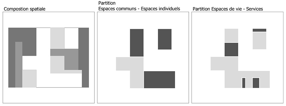
  • The partition between the public areas of life and individual spaces have been clearly defined, we note that in most cases public areas are treated and lived only as a single space. This uniqueness makes them user-friendly.
  • This spatial continuity does not necessarily pass through complete transparency of space but rather by treating its fluidity.
  • Paradoxically, in Cases Study Houses, the issue of the treatment of the living areas is to successfully occupy and qualify the while maintaining their full fluency.
  • In most cases, the space is occupied by objects that are generally different services or facilities: fireplace, kitchen units, storage units etc … These objects have a completely floating position in space. Sometimes suspended, they do not touch the ceiling or the limits of space. Although it irremovable, he conferred the status of their furniture. Their positions to structure informal space delimiting: circulations, living, living room etc …

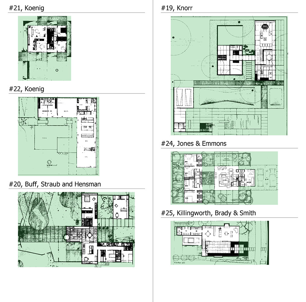
Example: CSH # 22 of Koenig # 18 of Ellwood

Continuity between indoor and outdoor spaces

  • Systematically, the spaces of the villas are worked to rendering uncertain, or even erase completely disintegrate the boundary between inside and outside.
  • This continuity is obtained by different treatments. This is achieved by processing the material of course, but also by different spatial treatments.
  • Most times it is the creation of spaces to the statutes completely ambiguous and unexpected: Exterior or interior parts gardens, courtyards … These spaces usually have a spatial quality and use unusual.

Examples: HSC Soriano # 25 of Killingworth, # 21 Koenig etc …

Covered & uncoverd, closed & unclosed :

The systematic use of a frame structure allows absolute decoupling components of the different elements the villa. The roof, the fence and the structure can operate completely independently of each other. The architects of the program make use of this freedom radically new and original way. They differ on this point completely European architects of the same era that have become used to treat it differently..

A floating roof …

  • The roof is usually the first element of the Case Study Houses.
  • It exists by itself as an independent single element. If the frame system allows a system of modular panels, the roof remains monolith. It is most often the unifying element of the project.
  • While the shape of the villas can be very cut, roofing in general keeps shape and simple geometry, it is always flat. This flat slab may however breakthrough in some places, thus occasionally causing light.
  • Independence and importance are highlighted in different ways. This can be done through the use of contents. It may also underlined by great advances outside. These advanced mitigate the perception that one has of the facade. This is especially true as the roof of the Case Study Houses are usually very close to the ground, the ground floor villas beings. Finally, it makes great use openings transom further strengthening effect this separation and independence of the roof.

Examples: CSH # 16 of Ellwood # 22 of Koenig. / Counter example: # 20 Buff, Straub & Hensman

A structure that rhythm and releases

  • However, the slight fence and released is used here so completely original. The use made by the closing opposes a European vision (Le Corbusier …). The latter deals with the released end of the structure by detaching while remaining a hard element. It comes freely separating the spaces between the structural points.

Closings as screens …

  • If the roof is designed as a completely flat element and monolith, fence system, on the contrary is always completely free and lightweight.
  • Fences are treated here as screens. Lightweight, they hang or cling to the structure. They come and hide in full or in part spaces.
  • These fences are heterogeneous and separated.
  • Heterogeneous, as the Case Study Houses are working on a whole range of variable screens. This panel has a multitude of qualities of materials and areas: opaque, translucent, textile, smooth, textured etc …
  • Dissociated since the closing of the villas can be stripped in several layers, each bearing a closing quality: Climate fence does not necessarily coincide with the visual fence or light etc …
  • The roof dissociation – fence is the source of all the spatial richness of Case Study Houses. The house always extends by a multitude of spaces with multiple and different spatial qualities. These spaces are qualified in their uses, partitions and structure the project in its composition.

<Previous pageNext page >
Case Study House Program, Problems and solutions – Partition, composition and hierarchy

Separations:

From public to private …

  • Systematically the Case Study Houses adopt vis-à-vis protection attitude of the street or public domain.
  • Each time, they refuse any guidance on the street and turns her back systematically.
  • The side of the house facing the street is generally completely blind. The villas refuse any effect of openness and appear on the street in that they have no façade.
  • The villas are often separated from the public domain by a rear garden.
  • The dividing line between public space and the interior of the house is always clearly drawn.
  • This dividing line marking the boundary between the interior and exterior of the house never matches from end to end with the physical limit defining interior and exterior spaces of the house. Thus, some outdoor spaces can be found back towards the inside of the house (thus forming yards, patios etc …), others can be discharged to the outside though covered (such as porches for example). This issue will be thorough about the « spatial diversity ».

The individual and shared…

  • This partition is also systematically established in HSCs.
  • Usual, this partition is not in the case of the Case Study Houses, treated as a true separation day – night; but rather as a boundary between usability spaces, social, individual spaces and personal life.
  • This score is expressed in different ways. Distribution and typology of the project are used to establish a clear distinction between these spaces. The boundary between these two types of space is usually treated radically different from that between the public and privately. This limit is not usually treated as a line of thin and opaque but sharing via internal or external buffer spaces.

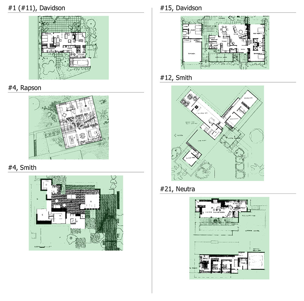
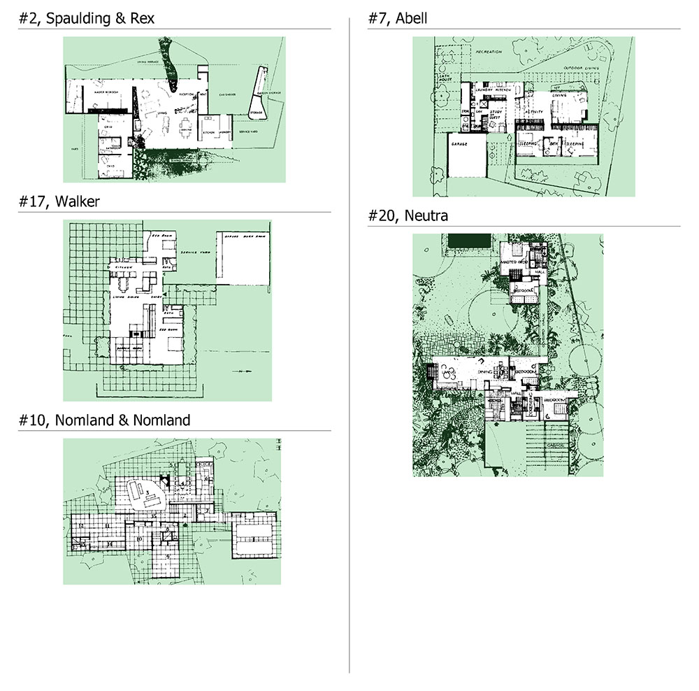
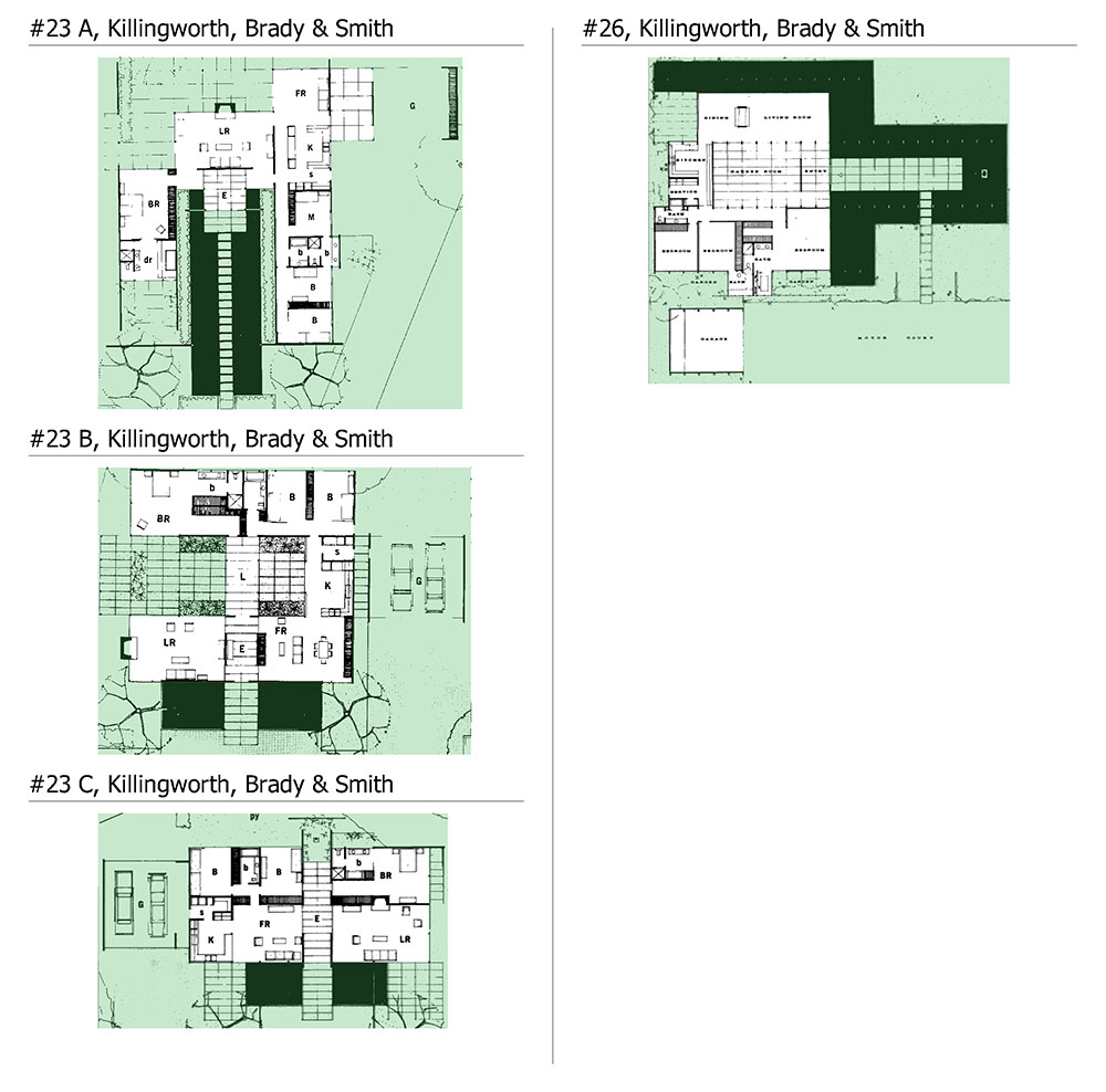
Examples: CSH # 3 Wurster & Bernardi, # 4 Rapson # 20 of Neutra

Equipment and functional living spaces…

  • This partition is similar but different from a partition type used – served.
  • This organization between amenities and living areas are generally treated by the Case Study Houses differently from usual spatial partition. Because it does not refer to a line between two types of space but rather between what is about space and what the order of the function. So this is finally a partition distinguishing what is around the area of what is not.
  • And services are covered here often completely minimum and condensed manner. They are either dense, opaque cores, or they take into space a completely floating status and furniture.

Examples: CSH # 22 of Koenig # 16 of Ellwood…

Protected ou exposed…

  • This differenciation means the spaces according to their relations with the outside.
  • It distinguishes the open spaces to the outside of protected areas and declined.
  • This is a radically different designation of the physical boundary between interior and exterior spaces.
  • This partition is not systematically addressed in all the Case Study Houses. Protected areas are available along the limit private – public.
  • It thereby provides a typical organization in the Case Study Houses based on the sequence of spaces: Street / outdoor areas / Protected areas / spaces exposed / Environment.

Examples: CSH # 22 of Koenig, # 20 Buff Straub and Hensman, # 16 of Ellwood

Composition:

Grid :

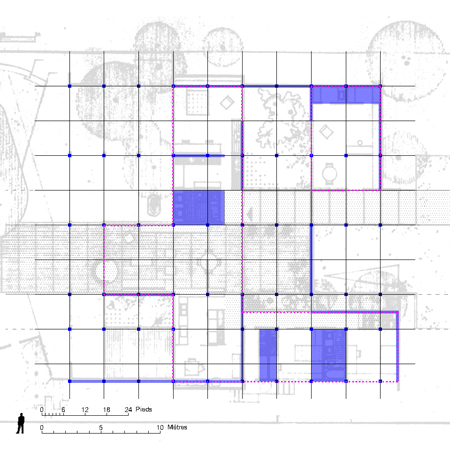
  • The Case Study Houses are mostly from a composition screened.
  • The frame is not used as a systematic and binding tool. It refers to a process. Instead of using a form that is creating broken symmetry, axes, inversions, work is more in an additive logic around elements structuring the project.
  • The frame is resilient, it spreads endlessly. It is egalitarian, does not favor any a priori point, no convergence.
  • The frame is ad hoc and repetitive. System applied to the structure gives the frame. All Case Study Houses use a structural frame system.

Examples: All CSH / Counter-example: Eames & Saarine

  • The frame supports the modules use.

Axes :

  • In most cases, the composition of the villas are structured around one or two axes.
  • All spaces are articulated on these axes by hanging onto it.
  • These axes composition then generally carry the traffic. But this is completely implicitly because most often in the Case Studies, circulations are not characterized, the space being completely worked smoothly and continuity.
  • It should be noted that in most cases the villas are on one floor. Thus all of these partitions are marked only in one plane and the houses of the composition is completely horiz

Example: CSH # 16 Ellwood Ellwood # 18, # 24 Jones & Emmons / Counter-example: Koenig

<Previous pageNext page >

Case Study House n°20′, by C.Buff, C.Straub, D.Hensman

Constructive options:

  • In this villa, architects use a wooden structure. They still retain the idea common to all of the Case Study Houses of this period is the use of factory-prefabricated elements.
  • The basic structural element of this home consists of scales-beams (box-beam …) against light in plywood. These beams are covered with waterproof panels made themselves to base plates against plywood. They also use to cover the common areas of curved panels. These panels are entirely prefabricated in the factory … The architects will speak about the use of these vaults « They are an important visual aspect, but the beauty of the spaces does not depend upon them. They add the richness of curved space, and the sensuous satisfaction of curved volumes, but what was more pleasing were the vistas from every point. As in the piazza system of European cityspaces, you move around a bend and the spaces are revealed. You wander rough space. « 
  • The panels and vaults were taken and assembled on site. Assembling the set of « panels-vaults » of the central area of the home require half past one …
  • This unconventional and light build, has made it difficult to obtain various permits required for construction. The services are very skeptical about the viability of the project and require prototypes testing …
  • These reasons and others related to the scale have not really helped to make substantial savings compared to traditional construction, although the villa was partially industrialized … This is generally the case in all experimental approaches.
  • Another point that is worth noting is that the construction of the villa required no hoist, crane etc …
  • “The character of the space was very precise, and there no overhangs. Overhangs were omitted because of the numerous trees on the property and adjoining lots, while the preciseness is a consequence of the engineered house ”. (Straub)

Figure 1:

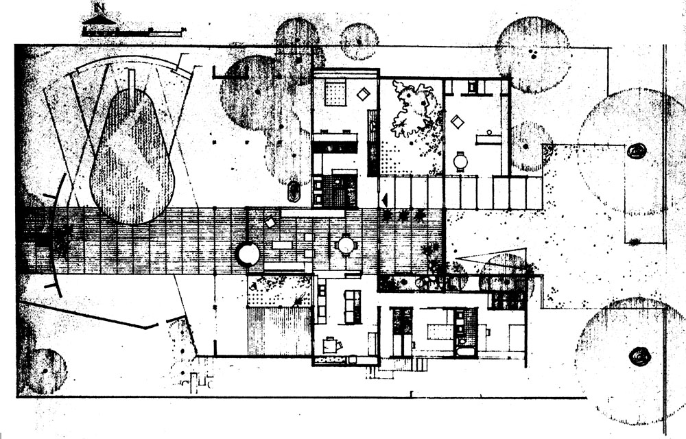
  • The plan is organized around common rooms: living room, kitchen, dining room formal and informal.
  • A first extension includes the children’s bedrooms, a second one of the parents. Finally, a third more isolated extension includes a desk. – All the main rooms open onto courses or outdoor terraces.
  • The space of this villa consists of parallel strips highlight continuities. In the center, a life strip is surrounded by either side of two strips of circulations. Other areas are distributed sequentially around these two bands.
  • The structure is composed of a spaced scales beams frame eight feet. It is organized perpendicular to the horizontal distribution of the house as described above. The structure is in pre-existing building. It exists all over the square, or is part of the villa. She has slipped between the many large trees that make up the field. The perimeter fence, opacities and then coming translucencies Sign on freely in this frame …
  • The house is limited on three sides: north, south and east by large continuous opacities. (In fact, it is completely opaque the north and east with some south side openings). It is completely focused on protected areas: the patio and garden.
  • The architects have treated this villa in this way, thinking that sooner or later the adjacent land would be occupied by other villas. It is therefore to treat a common ownership « in advance » …
  • The location of the poles is determined by the meeting of the first frame (East-West), which is the frame with the second operation (North-South), which is the structural frame.
  • The game of opacity, transparency, translucency next, freed from all functional or structural constraints, define spaces, trapping voids or leaving free outdoor spaces.

Figure 2:

  • Figure 2 shows the east-west spatial sequence of the plant life band. When the cross in its length is known a very varied course.
  • The rear garden of the house, which separates it from the street is happening in overcast but outdoor space that allows to park cars.
  • Then crosses an opaque screen, while passing a covered non-enclosed space (porch) with an open area closed (the patio). This situation is recurrent in the Case Study Houses: the symbolic and spatial entrance of the house actually corresponds to an output to an outside area. This will toggle a covered area and not closed to an open area and closed, closed to the inside of the house. The physical and symbolic entries are separated.
  • Continuing our journey, we finally entered the house physically by dragging a covered and enclosed space. This space symmetrical but covered patio is in continuity. It corresponds to the dining room. This space is separated from the next by a fabric filter, translucent. So there has two separate areas but the translucency of the filter introduce some porosity.
  • Continuously our journey by another covered area and closed but resolutely open to the outside, the abode.
  • Finally, in a last time one enters a covered outdoor area: terrace; then discovered the garden.

<Previous pageNext page >

Case Study House n°22, by P.Koenig

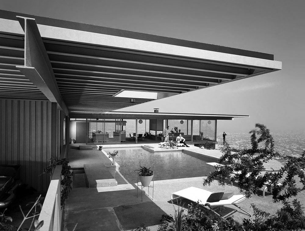
Koenig designed for the Case Study Program two villas. It designed in 1959, takes advantage of the remarkably specific site that was imposed. The land is 150 feet by 86 feet, it is situated on the edge of a cliff overlooking the city of Los Angeles.


Constructive options…

  • Standard parts used by Koenig to build his house are the same as those used for the construction of commercial architecture. The idea of Koenig divert metal elements to build a house is that steel producers refused at first to adapt their range to the domestic construction. This is explained by the fact that the volume of sales they could achieve for the architecture of the houses seemed too small …
  • Only two metal beam sizes are used for home, I-beams 12 inches (about 30 cm), and H columns of 4 inches (about 10 cm).
  • This structure is disposed on a structural frame of 20 feet (6 m). – The roof is composed of T 5 inches which allows it to withstand 20-foot beam and between the false doors 7 feet.
  • Koenig :“ I have allways dreamed of using stainless steel, but it was prohibitive in price. The new steel will be truly stainless, there are no open pores on the surface. To patch a nail hole you simply apply vinyl paint of the same color ”.

Figure 1 :

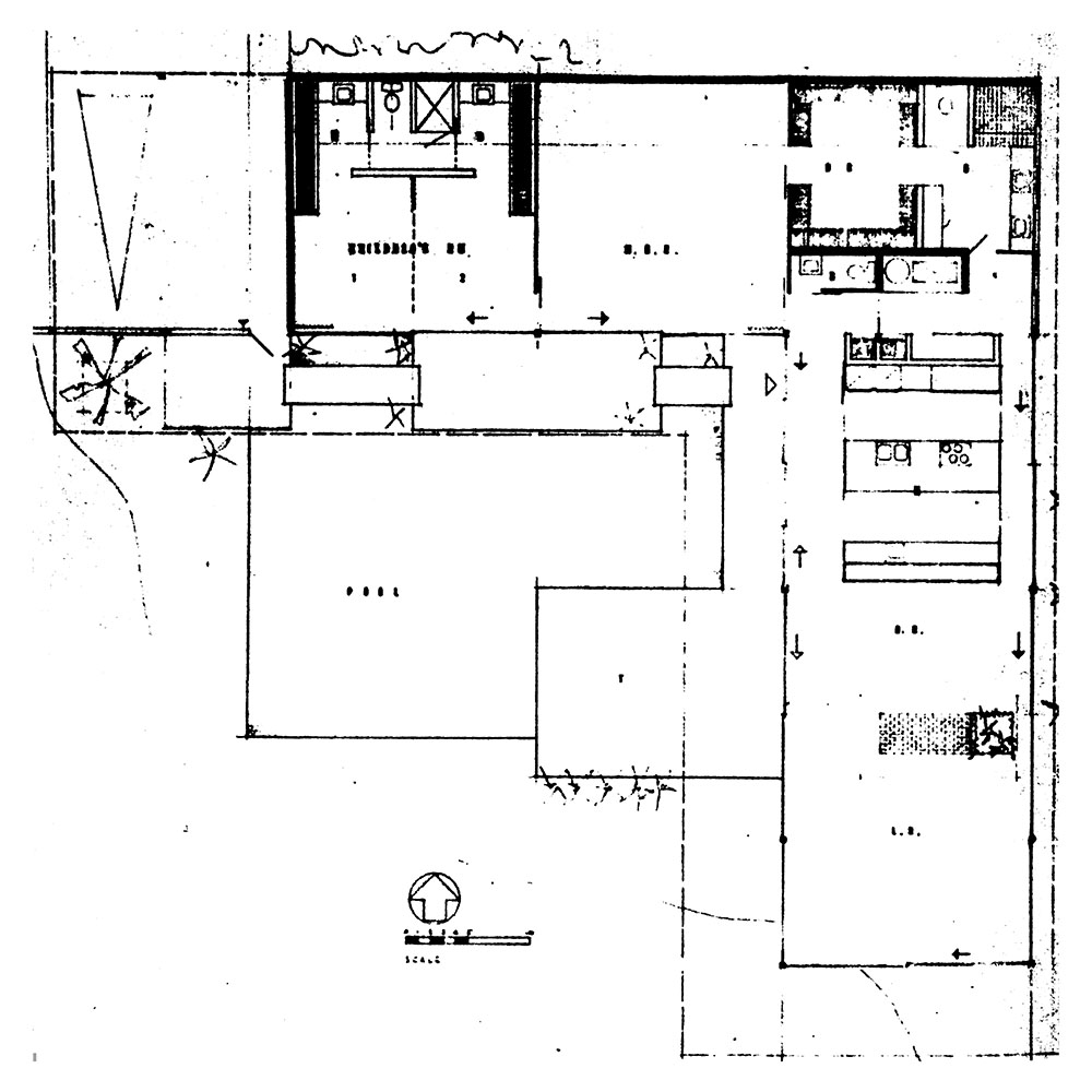
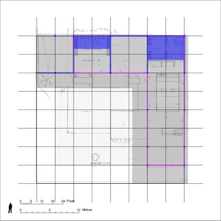
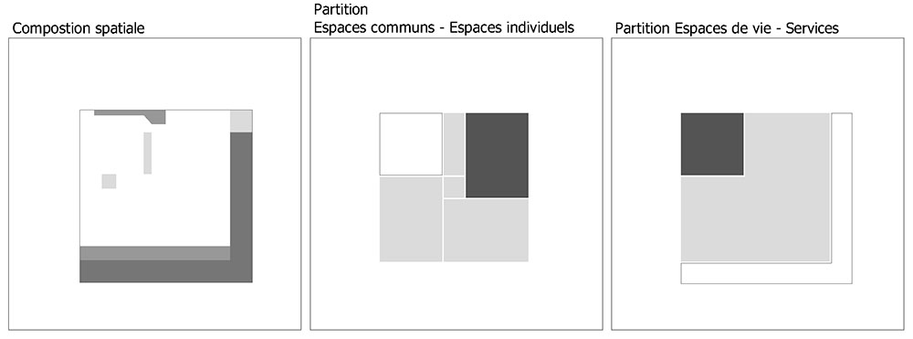
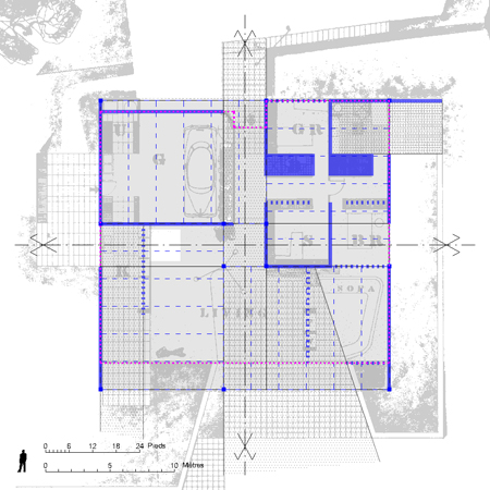
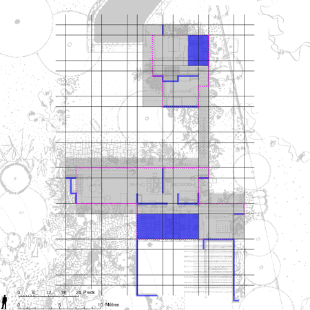
  • The project consists of a grid of 10 x 10 feet.
  • The entire project is in a square of side 80 feet (about 24.5 meters).
  • The villa take the shape of an L occupying the northern and eastern sides of the square …
  • The house has a uniform thickness of 20 feet corresponding to the structural frame of the building and regular.
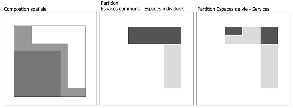
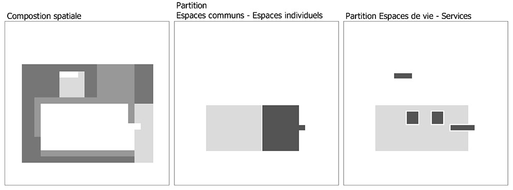
  • The partition functions and spaces is particularly clear: in the north wing are the individual spaces, rooms. In the east wing, public areas …
  • The house backs onto an opaque barrier. This continuous opacity and unique barrier insulates the house from the street.
  • This barrier actually forms the boundary between inside and outside the home. Thus, it returns some areas to the outside as the porch. Therefore, the real entry into the house is paradoxically when leaving the covered area of the « car-port », we cross the wall to be on the terrace by the pool.
  • The living areas are common, are treated in complete continuity. Terraces, Living room, dining area … This continuity is designated in the figure by the shaded area points …
  • The spaces of closed life gathered in the east of this area. The boundary between inside and outside is as unobtrusive as possible. Completely transparent, with no opacity, it is treated by very large windows. The pace of these berries is completely based on that structure.
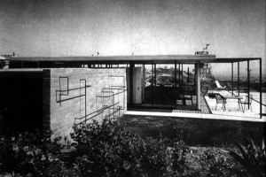
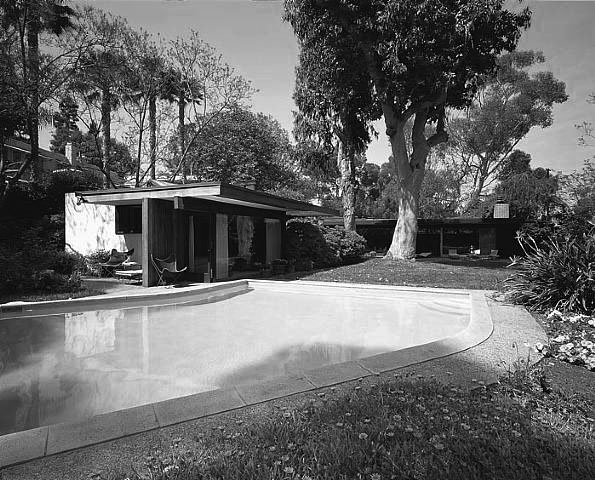
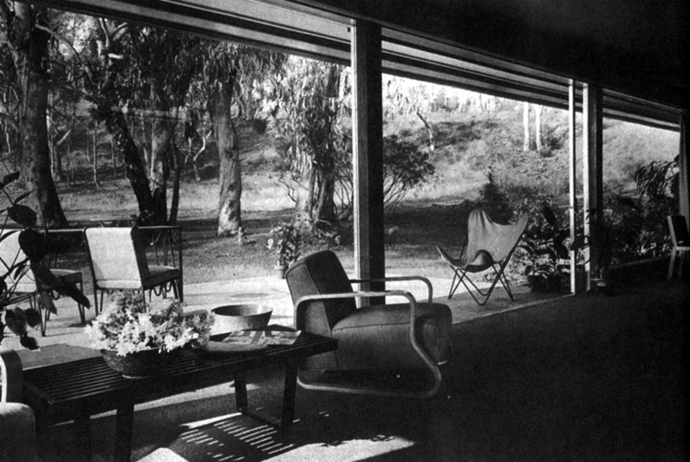
  • The few islands in the middle of the continuity of the zone are functional elements that cloud the living spaces. These are the kitchen cabinets, the fireplace … They are treated so that it does not impede absolutely felt continuity of space. Indeed, they are treated like furniture. They adopt a floating position in space, they are not related to any of its limits both vertical and horizontal. They thus come fully secondarily occupy space … (See photos below)

Figure 2 :

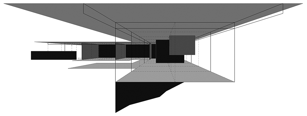
  • This scheme allows to understand the peculiar way in which Koenig discusses the living spaces in this Case Study House.
  • Basically the opacity of the wing, the rooms occupied by enabling lean back home and to separate it from the street.
  • Seen here in the foreground, the continuity of the common areas, rhythmic very broadly by the metal structure.
  • Only a few floating elements are opaque in places space …
  • This continuity is enhanced by the very high presence of the roof and the soil composition.
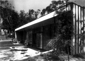
  • Roofing: it is completely overwhelming. By cantilever effects, it stretches completely the space. She totally blurs the boundary between reading the exterior and interior spaces.
  • Sol: the villa is situated on the edge of a cliff. The floor of the house comes in places slightly elevated above the slope and back to other places …
  • This soil decomposition is underlined by the presence and treatment of the pool.
  • This game between the floor and roof finishes to give the space character « suspended ». The only border that seems clear is that which separates the villa from the street. Any other limits whether vertical or horizontal fragment seem to completely disappear completely. Thus the interior of the villa seems to fly completely between heaven and earth.

<Previous pageNext page >

Case Study House n°16′, by C. Ellwood

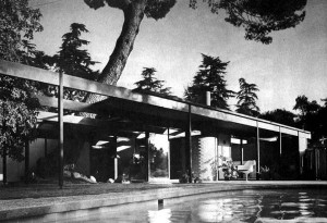
Craig Ellwood was still a very young architect when he was selected to design a Entenza Case Study House. This is the first in the series of three villas he designed for the Case Study House Program. It offers a house here where he developed while working on multiple outdoor spaces qualities that come to extend and enrich the home of various and unexpected ways….

Constructive options

  • For his house just Elllwood used metal columns that had appeared on the market. Indeed, due to the decline of the railway, many found themselves unused rails produced. They were recast which raised metal companies to develop new product lines …
  • The use of square columns instead of columns H can save a lot of money, they are lighter and can simplify a number of details such as those bindings woodwork.
  • The beams used are I to 6 inches and 36 feet long.
  • Translucent panels 10 feet in height are treated as extended walls of the house.
  • The interior walls of the house are also treated as screens. They are of the same material as the exterior walls to express continuity between interior and exterior spaces spaces. These panels are by exposing the structure which is painted black. They are off the ground, and are separated from the ceiling by a transom window.
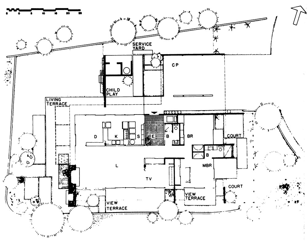
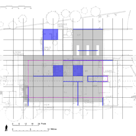
  • The villa consists of a grid of 8 feet.

  • The house is divided into two areas occupied by the circulations, one inner and one outer longitudinally extending in the direction of the project.
  • The boundary with the street is freely drawn by a solid line turn opaque or translucent tower. This watershed limits any tower covered and not confined areas (like the porch); other spaces, enclosed and discovered (as the court of children); or some interior spaces and with others outside. This boundary separates Similarly, the prices of the rooms from the street by a series of panels of translucent glass …
  • The indoor and outdoor spaces are organized around the two perpendicular axes carry the project.
  • The partition between social spaces and individual spaces is along a North-South axis passing at the entrance.
  • It amazing how close the villa whose area is in a simple rectangle, which is built with a completely systematic metal structure does not prevent to achieve a wide variety of spaces and uses. Each space is fully qualified. This remark is particularly sensitive to the game of indoor and outdoor spaces.
  • This is illustrated for example in the input sequence: the porch is divided into two parts, creating a covered walkway for pedestrian access. Basically, the villa allows a double entry: service entrance that allows access to the court and the kitchen but also main entrance angles. The patio at the entrance allows movement of the light at the output while creating a view.
  • Each room is extended by outdoor spaces in direct continuity with the interior space. The « master bedroom » has a double orientation opening on two distinct areas, each with a different status: an enclosed space and privacy to the east; a terrace that opens fully to the outside overlooking the far south …
  • Similarly, the living areas have a triple orientation with three types of large spaces.
  • Open to the outside distant and providing a wide view to the south: the « view terrace » as baptized Craig Ellwood.
  • Open to foreign direct space and close to the garden: the « living-terrace » is protected under large pergolas. It comes in direct extension of the dining room.
  • Much more protected, the « child-play » may have lived both as a space service and much more closed and intimate space.
  • The position and status of the service areas is much less clear. Ellwood seems to make the difference in service areas such as bathrooms that are treated as opaque and irremovable cores while the space kitchens are treated as completely at Koenig transferable manner … These spaces are scattered and fragmented in the plan of a house.

Figure 2:

  • The diagram shows the spatial sequence extending along one of the two structural axes of the project …
  • From west to east, succeeding are: the « living terrace » / « child court » / the entrance patio / porch for cars.

<Previous pageNext page >

Case Study House n°9, by C. Eames et E. Saarinen

This house was designed in collaboration with Charles Eames and Eero Saarinen. This villa was built on the same site and with the same construction system that the villa # 8. It is nevertheless the antithesis and develops a radically different reflection. This villa was built for J. Entenza himself. She adapted to its requirements. Entenza wanted to focus on the reception areas.


Constructive options…

  • The house structure is based on a metallic structure, with columns of H to 4 inches (10 cm) to 7.5 feet tall.
  • The aim was to enclose the maximum possible space in shape and structure as simple as possible.
  • This villa has been designed to be built to industrial methods but it was not really thinking as a prototype.
  • The living room was designed according to the principle of « elastic space. » Architects have developed the idea that space can expand or contract depending on the life of its occupant and the number of guests.
  • The engineer Edgardo Contini project expresses the general advantage of the villa: “ The intention of the Entenza House is to eliminate structure to be anti-structural, to be anonymous as possible. In the Entenza house no beams are expressed, no columns visible.”

“ The total concept was architectural : it was resolved in terms of architecture, in contrast to the Eames house, which was structurally assertive.”

Figure 1 :

  • This villa is in addition and in contrast to the Case Study House No. 8 also called Eames House, located just next door.
  • They both use the same structural system. This system is based on the metal profiles of high lightness.
  • Yet in each case the architects make a radically different use. It is interesting how two radically different about can be developed on the same site with two identical structural systems and a similar programming.
  • In the « Eames House » structure is completely highlighted. It is structuring, not only literally but figuratively: it articulates, rhythm and cadence of the project. It is everywhere the first expression. – In the « Entenza House », the search is at an entirely different level. The structural system is used in a much more minimal and paradoxically much more efficient than in the Eames House.
  • Moreover, the structure is not used here to articulate and rhythm space. Rather, the goal seems rather in Entenza House to break free completely to access full spatial and programmatic flexibility.
  • The Entenza programmatic requirements for the house allows us to better understand the basics of thinking developed by Eames and Saarinen. It is in the treatment of the relationship of the common areas and individual, intimate and shared the villa shows all its richness.
  • The house is in a square of 54 feet (about 16.50 meters) square it occupies almost entirely.

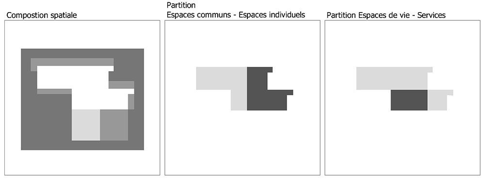
  • The program is distributed as follows: the North-East quarter is occupied by « individual » rooms and private (rooms, bathroom); the northwest quarter, for service parts (laundry, garage, cellar …) Finally, the southern half of the common areas (living room, dining room, kitchen …) – Each part is separated by full or partial opacities games but also translucency. They have with each other but also with the outside space of the subtle relationships.
  • Thus, the input is separated by a simple translucent filter garage which is lit from overhead way. The light is thus transmitted and scattered by the filter in the manner of lateral entry.
  • The kitchen is separated by a wall furniture fair amount has so obscure the view. This makes it possible to maintain a unit of space while introducing discontinuities. The separation between the master bedroom and dressing room is treated in the same way …
  • The connection between the room is treated with a sliding panel will allow to separate or unite spaces in the main bedroom and living room.
  • Another type of discontinuity is introduced by the fireplace, treated fairly minimal, floating and movable.
  • A final type of discontinuity is introduced by treating the soil levels of differences in the villa. This difference between the northern half and south of the house is equivalent to about 90 cm. It allows the creation of large footboards in the middle of the stay. These steps by creating casual seating allows the opportunity to strengthen the space of the living room around the fireplace. On the other side, between the bedroom and the living room, the height difference allows the creation of a sofa next stay with the top of the file arrives at the chamber floor.
  • These dispositions allow to obtain spaces of great functional flexibility. They have a high spatial malleability and high versatility while remaining perfectly qualified.
  • A number of scenarios illustrating this elasticity are studied in a series of diagram (see next page):
    • Scenario 1 : We start here with the basic element around which is built the common area in the villa Entenza. This is the part of the living room occupying the south-eastern part of the villa. This element is limited by the fireplace and the sofa that closes the space of very intimate way. On the other side, the kitchen that can be associated indifferently to 3 different types of areas: living room with part of which is bounded on the east by emmarchement transforming this part of living a formal dining room ; or with the internal extension of the kitchen open to the living room: creating an informal dining room. Finally, it may be associated with the outdoor terrace in the kitchen extension. Thus creating a place for outdoor dining.
    • Scenario 2 : In this scenario, the basic unit is associated with the chamber and part of the terrace creating a very intimate spatial sequence type: bedroom + living room + terrace, privatizing some way the living room and terrace. This scenario shown in photos 3 and 4. We clearly see the alcove effect in which the chamber is taken.
    • Scenario 3 : Here, the master doubled the portion of the space on the other side of the fireplace. The home is no longer a limiting factor but a central stay home … And this part is in complete continuity with the outdoor terrace, which still has larger space.
    • Scenario 4 : This scenario explores the possibility or common areas are assembled and dilated to the extreme. Here they form a very large reception area. This space is both fragmented and united. It includes an input sequence and various conducive to discussion forums.

<Previous pageNext page >

Case Study House n°20, by R. Neutra

“It is a period to which many of us have been anxiously looking forward for long years ”. These words written by Neutra early in the program shows how the Case Study Program was an expected event. Indeed, Neutra wore a constant interest in innovation in the field of design and construction of individual houses. During these long years, Neutra thought to bring out of the home craft to industrialization. The two-bedroom house is a problem that has already solved many times. Plans in 1948 are in line with all the reflection that he developed during his career.

The constructive options:

  • Assembling a prefabricated core services and containing wet and heating installations was a limiting factor of the plan.
  • This core was placed so as not to prevent future extensions of the villa.
  • In a second step, an extension was added to the south in 1958.

Figure 1::

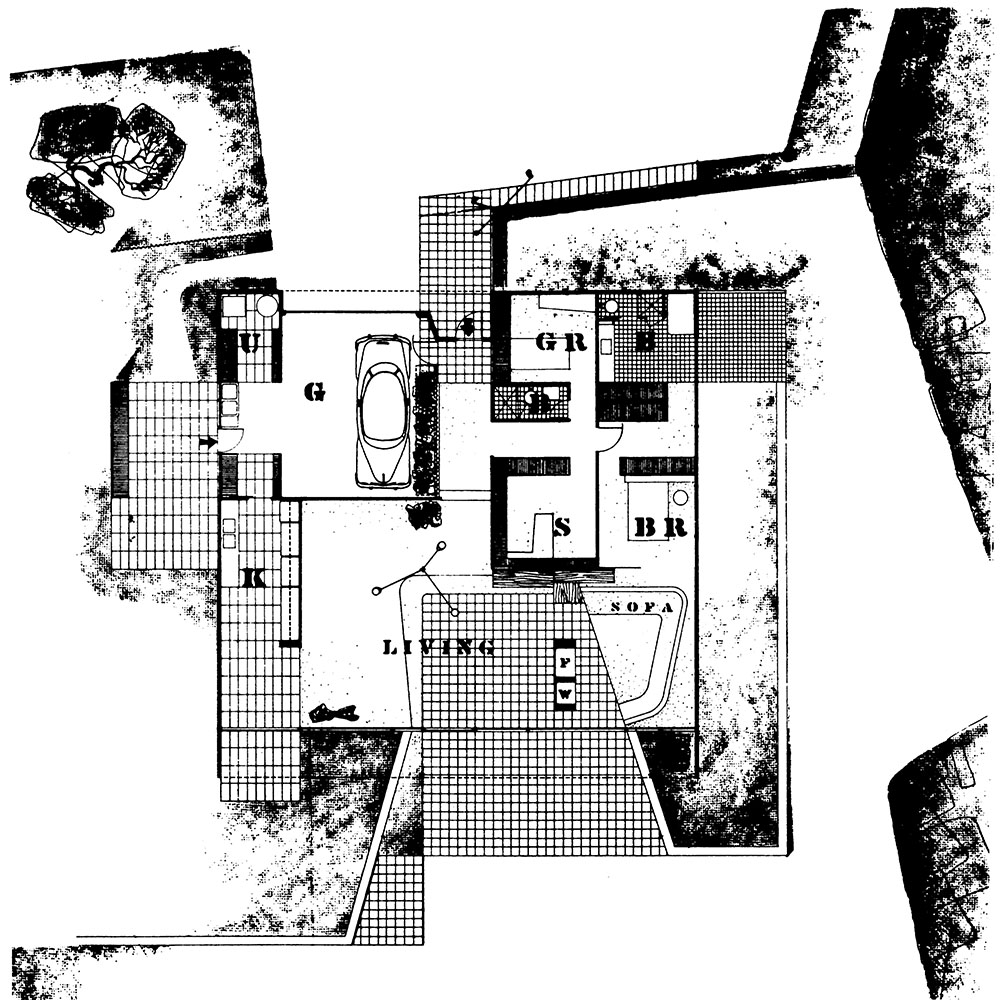
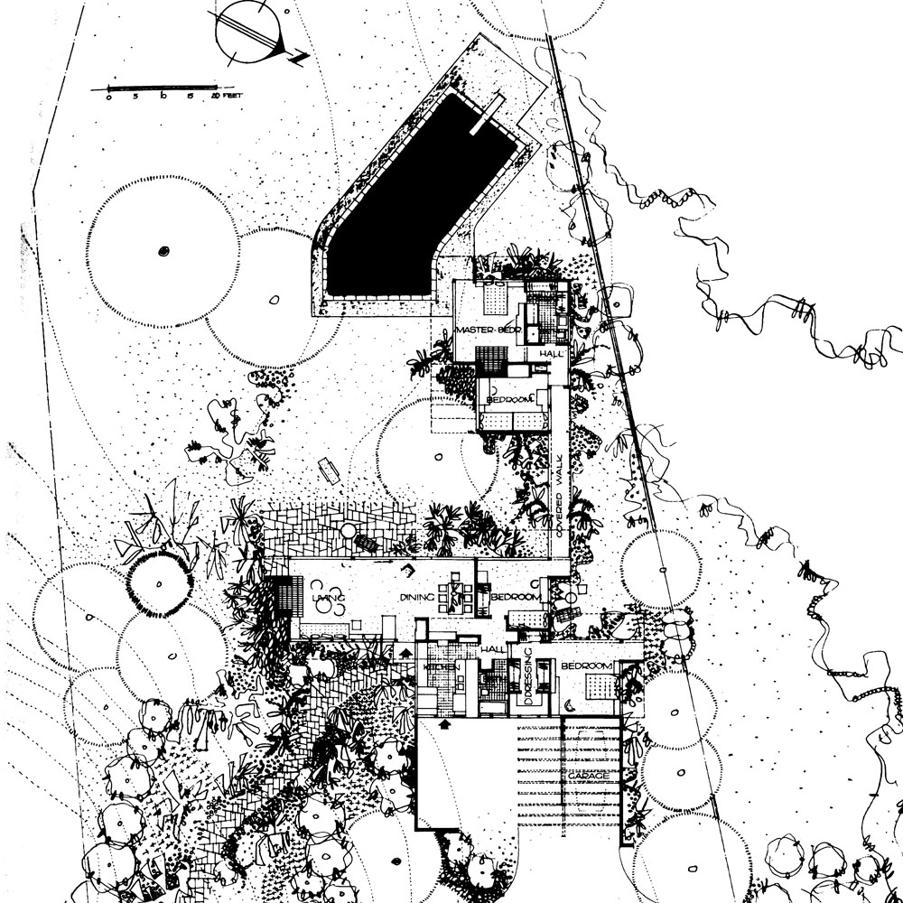
  • The house has an L-shaped plan with the dining room and living room facing south open on a « social » patio bordered by giant Eucalyptus.
  • Both bedrooms have their own open to the west garden.
  • The composition of the house based on a frame alternating category successively 10 feet and 4 feet.
  • The combination of these two measurements: a structural dimension and the dimensions of prefabricated wet core which houses all services (kitchen and bathroom) for the 10 feet.
  • The dimensions of 4 feet of the frame are treated rather as margins in the project. All circulations are collected. It allows to arrange a set of continuities and transparency through the project. It also allows the posting of items.. Elle autorise également le détachement des éléments.
  • The structural system is not emphasized in the project. The structure has no presence or strong or rhythm in the project.
  • Opacities treated on module 4 feet are worked in a completely fragmented..
  • They support many advanced and Returns indoor and outdoor play areas.
  • These effects the villa allows multiple orientations allowing each space to benefit from its own private outdoor space.
  • The roof is covered in this same principle. It is widely comes in front of the façade is thus withdrawn leaving the elements exceed in height as chimneys ..
  • All these treatments contribute to the effect of dissolution of the house into the surrounding nature, with which she seems to merge.

Figure 2:

  • This diagram shows the north side of the house, it helps to understand the relationship maintained by the spaces of the house with the environment.
  • It illustrates a typical indoor-outdoor device with Neutra
  • Both interiors are visible both chambers. Same size, the relationship of their interior spaces with the exterior space is treated with the same repeating pattern that creates an effect of outside in space.

<Previous pageNext page >